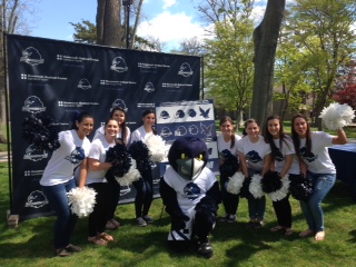
WEST LONG BRANCH– The Monmouth University Department of Athletics revealed Monmouth’s new brand identity and logo on May 2 during Monmouth Pride Day on the Shadow Lawn, prompting mixed reactions from M.U. students.
The Monmouth University re-branding initiative was led by the M.U. Athletics Department and marks Monmouth’s transition to the Metro Atlantic Athletic Conference as well as the Big South Conference in fall 2014. The Athletic Department hopes that the new visual branding will establish a new identity for Monmouth University Athletics, according to a statement issued on Monmouth’s website.
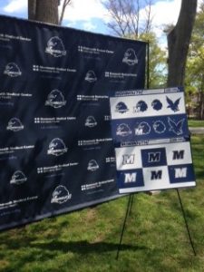
The new logo includes an updated image of the Monmouth Hawk featuring “Monmouth” in bold type beneath the image. Additionally, an “M” will replace the “MU” letter mark that has traditionally been used at Monmouth since 2003. The rebranding also includes a number of secondary logos that will be used in marketing and identifying Monmouth University.
In Monmouth’s statement, Vice President and Director of Athletics, Dr. Marilyn McNeil, expressed her enthusiasm towards the re-branding initiative, stating, “Athletics is very excited about the new marks….I believe our students, especially our athletes, will love the dynamic look of our new Hawk and the bold statement made by the spirit ‘M’.”
Generally, students appear to be quite accepting of Monmouth’s new image. Susan Elwood, a junior with a major in Communication at Monmouth, stated, “I actually love the change…Being a [public relations] student I always feel that there is room for improvement with an image. I know Monmouth’s athletics program is looking to gain more attention and I think this was such a smart move by them.”
Elwood went on to state, “By giving Monmouth a new face and the logo of just the ‘M’, it shows that they have the initiative to adapt and bring new things to the program. It’s a great marketing technique.”
Junior and future Hawk TV Station Manager, Alexa DeRosa, echoed Elwood’s positive response to the re-branding, stating, “I think the new logo is what we need, especially because we switched conferences. We are now on the same level as teams we compete with in The Big South.”
However, the re-branding, and the way in which the project was carried out, has left many students upset.
The initiative was carried out solely by the M.U. Athletic department. Many students feel that the Athletic Department has over-stepped its boundaries by altering the University’s logo and overlooked the considerations of other organizations within the University, as well as the voices of the students. As a result, some students are left questioning whether the Athletic Department is over-exerting their authority.
Senior Journalism and Public Relations major, Amelia Hoke, stated, “I do like the change. I think it is more official, but I do not think it was necessary. It…should have been a joint decision [between SGA and the Athletic department] on whether or not it was going to change and what it was going to look like.”
Hoke went on to say, “Athletics took over in a harsh way, I guess you could say, as it is the logo for all of the University, not just athletics.”
The re-branding has created the necessity to alter the many Monmouth logos strewn throughout the campus. Anything emblazoned with the former logo, including Monmouth apparel, signage, and decals, now have to be changed. For clubs and organizations with budgets far more limited than that of the Athletic Department, this may pose an issue.
DeRosa of Hawk TV acknowledged this effect of the re-branding, stating, “As for Hawk TV and other organizations we now have to go through the process of changing logos; it is a long and hard process.
Despite split opinion on behalf of the student body, the new logo will in fact be representing the Monmouth University community.
Video created by Caitlyn Bahrenburg.