WEST LONG BRANCH, N.J.–As you may have noticed, the Verge recently revamped its logo to a more simplistic and sleek new design. Recognizing the wealth of creativity on campus, the magazine decided to hold a contest asking Monmouth students to submit their designs for a chance not only to win gift cards to local hot spots Rook Coffee and Broad St. Dough Co., but also to see their very own creation glistening atop the homepage each time they visit it.
Over two dozen logos were sent in by the February 28 deadline. At that point, editors, writers, and general members of the Verge voted for their favorite submissions. One design got an overwhelming amount of attention, and thus, a new logo was born.
The winning design was crafted by Anthony Paterra, a sophomore graphic design major here at MU. Paterra hails from West Chester, N.Y., and spends his time at school playing football with the Hawks.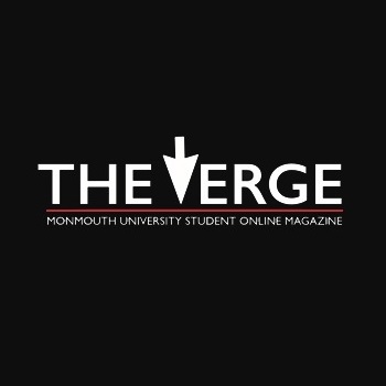
While brainstorming for the logo contest, Paterra wanted to come up with something that captured the essence of the Verge without being too flashy or complex–that is, a recognizable image that would stand out on the site, but not steal attention away from the content.
To capture his vision, he replaced the Verge’s “V” with an upside-down computer cursor, inventively emphasizing the online aspect of our magazine in a minimalist fashion. Using Adobe Illustrator, he fiddled with a few ideas and combinations before ultimately deciding on the winning logo.
“I try to make every logo that I create very simple but also full of meaning,” says Paterra.
Clearly, that comes through with this design. The sharp, straightforward text and the refreshing pop of red seamlessly blend with the magazine’s color scheme and the site’s overall theme. It is simple, but it says a lot.
Soon, the new logo will be saying a lot on merchandise, too. Members of the magazine are currently in the midst of designing apparel and other trinkets with its likeness, including shirts and pens. They hope to make them available to the MU community by the end of the spring semester.
Thanks to Paterra’s work, the student writing content featured on the Verge will not be the only thing astonishing readers. Now, our sleek new look will, too.